
When I listen to a thesis presentation, I need to get the big picture before I care about the details. Until I have understood the problem statement, for example, I do not care how an algorithm works or how its average-case amortized runtime complexity beats existing solutions. Not even if it is presented with a nifty visualization.
In other words, if the big picture of a presentation—its structure—is messed up, no amout of clever visuals can save it. The first priority is thus to get the presentation structure right.
What do I mean by presentation structure? The presentation’s composition of of its constituent parts. How much time you spend on which part. Which one you focus on. Which thesis content you shorten, or leave out entirely. Whether you include an example, maybe even a running example that comes up again at different parts of your presentation. Which running example. And so on.
Creating the structure is about making choices. Much like software architecture decisions, these choices are difficult to change later on. The goal of creating the presentation structure is thus to deliberately make and evaluate these choices early on, when they are still cheap to change.
When I prepared my first presentations, I always started by creating slides right away. This is a fundamentally bad idea, as it distracts from the structure.
As soon as I write my first letter on a slide, it has a font, a size, a color and a position. If I draw objects to form an info graphic, they have relative positions, alignment, proximity, contrast. All these properties force me to make choices. Or accept default settings, which are often ugly. Since ugly slides are irritating, they demand fixing. This ties up my time with tweaking. However, none of the visual properties of slides matter for presentation structure.
The key to focus on structure is to avoid details altogether. Use a medium that does not allow details. Thus shy slide-ware (Powerpoint and such) when drafting presentation structure.
My favourite drafting medium are whiteboard marker, post-its and a wall [1]. Since I am pretty clumsy with the whiteboard marker, and since the post-its are small, I simply cannot do details.
I use the process described by Nancy Duarte in her book Resonate. To make it tangible, I use examples from a presentation I did on presentation design [2].
Brainstorm
Write down all ideas for the presentation on post-its and stick them to the wall. One idea, one post-it. This includes content ideas, but also ideas for visualizations or anecdotes you want to tell. In this step, do not filter. All ideas make it to the wall.
Use your thesis document as the main source of presentation content. You have done the research, the experiments, implementation, etc. In other words, you have created plenty of content already. For a thesis presentation, the brainstorming step is not so much about coming up with new content, but about getting its main points onto the wall.
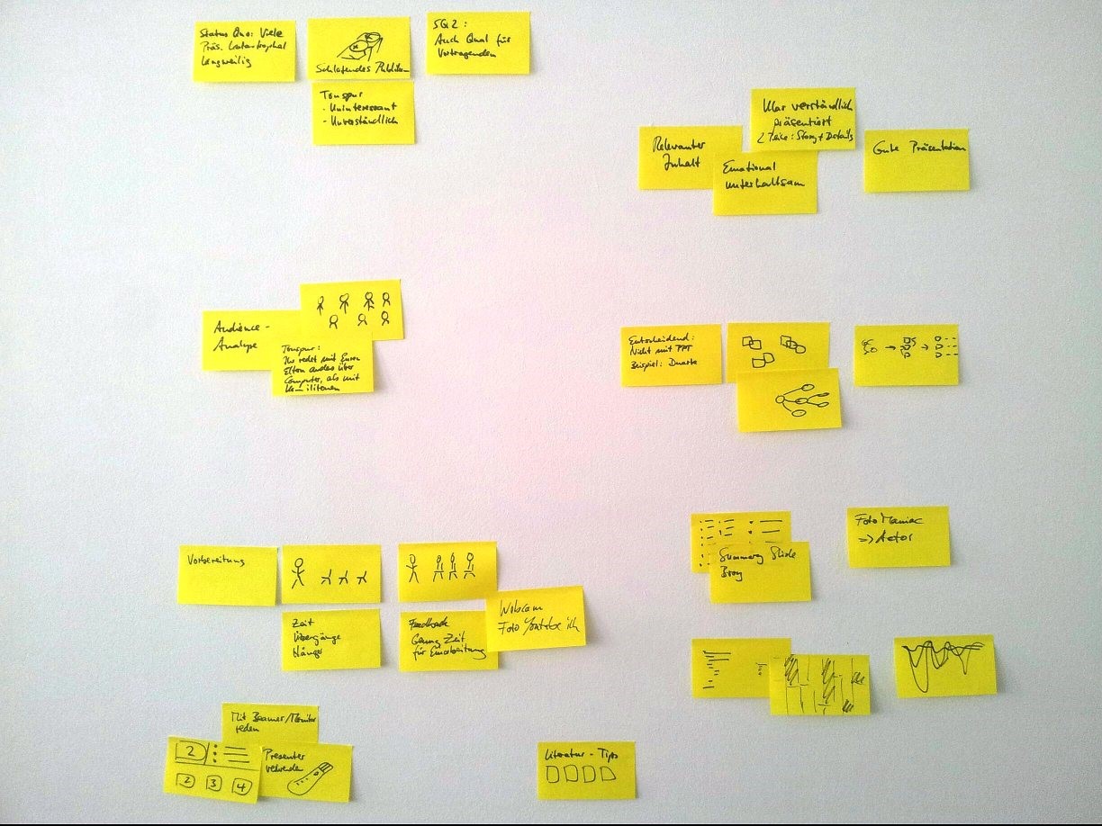
The image shows my result for the brainstorming step. Some post-its contain keywords. Others contain rough sketches for photos, images or visualizations I had in mind. They already follow a rough clustering, since I simply pasted the ones I felt were somehow related next to each other.
Cluster
Group related ideas by grouping their post-its.
For each cluster, write a post-it that holds its message as a full sentence. Use differently colored post-its (or pens) for them.
This step also comprises filtering. Since your presentation time is limited, not every idea can make it into the presentation. Filter redundant ideas and weak clusters.

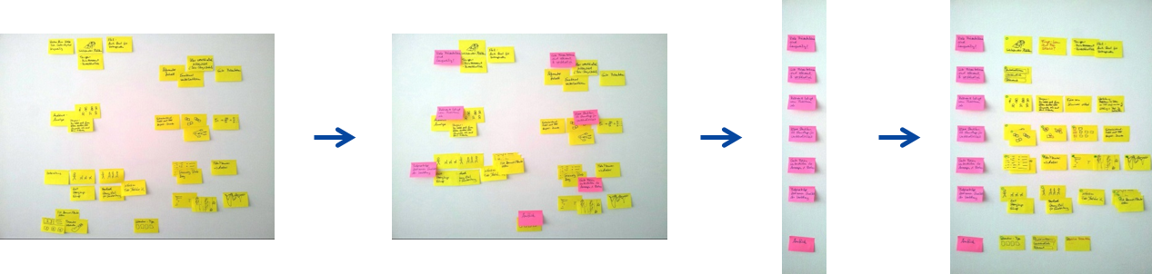
The image shows the cluster messages in pink. It took me several attempts per cluster to find a crisp sentence that reflects what I want to say here. I rearranged some of the cluster cards. I also discarded several that did not add valuable content.
Order messages
Take the cluster-message post-its and order them for best impact on the audience. Simply make a step to the right where there is free wall-space and stick the messages there. Experiment with different orders. For each one, run a mini-presentation in your head to see how it feels.
I arrange them in a vertical line to have free space to their right for the next step.
Create slide mock-ups for each cluster message
You have now nailed down the messages and their order. Now create slide mock-ups. Use a single post-it to represent a single slide.
For each cluster message, think of the way you want to visually represent what you want to say in one or many slides. Scavenge post-its from the brainstorm-clusters, if suitable. Jot down bullet-points. Scratch out drawings or ideas for visualizations.
Focus on the rough picture of each mock-up, the details are added later in the implementation.
Think through presentation based on slide mock-ups
The mock-ups are much easier to change than real slides. You thus want to find problems and fix them in the mock-ups, before you create real slides. To do this, you have to give the presentation: Start with the first slide mock-up and state its main points (I typically do this silently in my head). Continue with the next slide, and the next, until you run into a block. For me, this often happens several times per cluster. Then change (reorder, throw away, redraw) slides until you go more smoothly.
The mock-ups are only finished, if I can run through the whole presentation without running into a block. Now the post-its turn into a specification. I’ll cover advice on how to create compelling slides in a separate post.

The image shows my final slide mock-ups [3]. Some of the post-its are still unchanged from brain-storming. Others are new. In some cases, I have sticked post-its on top of each other, often to note points for the narrative that I want to tell when I show a certain slide. The fourth row from the top contains three slides that outline the process that this post describes. You can see the small rectangles that depict post-its, their clusters and then the final slides. They are rough, but good enough at this point.
As all processes, this one is a simplification. Creating a real presentation is more messy and contains moving back and forth between steps. If I have visualization ideas early on, I take them down, even if the process tells me to focus on cluster messages at this point. Or I change the slide order 10 minutes before a presentation, if I feel that it works better in that situation. If this happens to you, don’t feel bad about violating the process. The goal is a great presentation, not process conformance.
[1] Post-its are not the only low-resolution medium. For me, mind maps on an iPad or pen and Moleskine notebooks also worked. However, post-its worked best for me. Since I stick them to a wall, I stand up and have to move around when drafting presentation structure. Somehow, this helps me think.
[2] The slides of the presentation are here. I give this presentation in the first meeting of the seminar on software quality at TUM, as the process is also helpful when you create your seminar presentation.
[3] If you look closely, you see that some of the post-its carry a small green circle in their left upper corner. I placed them during clustering to mark all post-its that depict visual ideas for slides. All other ones were either unfinished ideas that needed further working on, or anecdotes for the narrative.
Thanks to Roman Haas for reading drafts of this.

2 thoughts on “How to Draft Your Presentation”